
These maps show the complete motion of ice throughout Antarctica. The colours represent the ice-flow speed, with areas in reds and yellows flowing the fastest. This velocity map shows you how floating ice-shelves are fed by a dense network of ice-streams from the the continent. The so called ice-streams, in turn, drain individual catchments within Antarctica. I like to think about them as Antarctica’s veins.
The velocity distribution is measured by satellite data from many different space agencies and provide us with a better understanding of ice flow and how Antarctica might respond to climate change in the future. So why are there ice streams ?

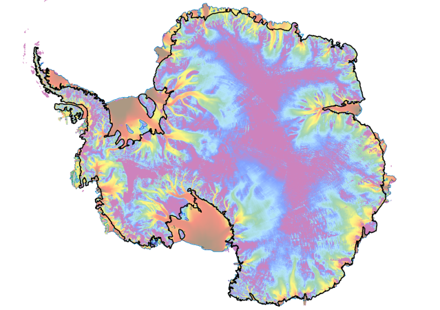
The second map shows you Antarctica’s bed elevation. If all the ice would be removed from the continent, this is how the landscape would look like. Red areas show you where the bed elevation is way above current sea level. Blue areas, in turn, correspond to areas below sea level and are threatened by rapid ice retreat, if current sea level continues to rise. With a closer look, you can see how the ice-streams lay in troughs within Antarctica’s bed. A small rise in sea level may therefore trigger dramatic ice retreat towards the inner part of the continent. You can think of it as “Antarctica would bleed out” – not a very pleasant thought though…

Viel Erfolg, lieber Polarchristian! Wir sind stolz auf dich, Angelika und Wolfgang
LikeLike